


CSS Grid
A two-dimensional grid-based layout system that, compared to any web layout system of the past, completely changes the way we design user interfaces.
CSS has always been used to layout our web pages, but it’s never done a very good job of it. First, we used tables, then floats, positioning and inline-block, but all of these methods were essentially hacks and left out a lot of important functionality (vertical centering, for instance)
A CSS grid allows you to achieve almost any type of layout. It is used for dividing up the different regions of your webpage into smaller sections or setting the relation between elements in terms of size and position.
It aligns your webpage elements with columns and rows just like tables. But, Grid isn't limited by a particular content structure. This makes it possible to create a vast variety of website layouts than would be practical with tables alone.
You can rearrange grid elements with any source order. This makes it possible to fit the layout to the context without changing the underlying markup.
A powerful auto-placement feature lets you quickly fill up available space, eliminating the need for complex calculations.
The grid allows you to overlap items when needed, which isn't possible with tables.
Now that we're familiar with the CSS grid, let's explore how to use it.
Using CSS Grid
In the documentation, you'll find that if you want to set up a grid layout, you must create a parent div element (the grid container) and one or more child div elements (the grid items). Let's try that.
    <div class="container">
        <div class="item">Item - 1</div>
        <div class="item">Item - 2</div>
        <div class="item">Item - 3</div>
        <div class="item">Item - 4</div>
        <div class="item">Item - 5</div>
        <div class="item">Item - 6</div>
        <div class="item">Item - 7</div>
        <div class="item">Item - 8</div>
        <div class="item">Item - 9</div>
    </div>
Now, Let's see what happens by applying the display property of grid and a property of a grid container called, grid-template-columns to set it to 3 columns with a width of auto,
.container {
  display: grid;
  grid-template-columns: auto auto auto;
}
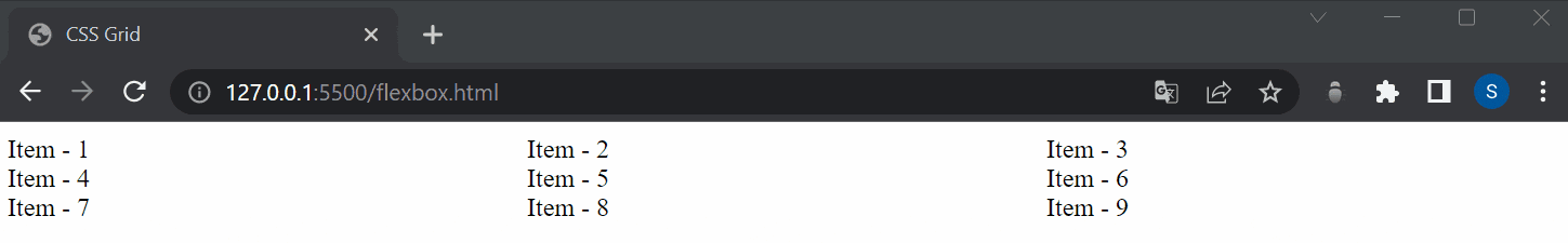
Now, all direct children of the grid container become grid items. Here, I have used a google chrome extension called Pesticides, which outlines each element to better see the placement on the page.
To get started you have to define a container element as a grid with display: grid, set the column and row sizes with grid-template-columns and grid-template-rows, and then place its child elements into the grid with grid-column and grid-row. Let's dive deep.
Basic Grid Terminology
Column — layout sections that go from top to bottom
Row — layout sections that stretch from left to right
Gap — the space between rows and columns
Grid Lines — the lines drawn that separate the various rows and columns into cells. The lines between columns are called column lines. The lines between rows are called row lines.
display
display: grid – generates a block-level grid
display: inline-grid; – generates an inline-level grid
Grid Rows & Columns
It defines the columns and rows of the grid with a space-separated list of values.
Before looking into its examples, let's look into different units you'll use while working with CSS Grid,
Units definition:
auto — takes all remaining space.
fr — is a fraction (ratio) of remaining space.
percentage — takes the percentage of all available space (total space of row or column).
repeat(<times>, <unit>) — how many times repeat space.
minmax(<min>, <max>) — defines min and max boundaries of taking space.
The fr (fraction) unit is a proportional unit that was added to the CSS grid, we use it to calculate the ratio between cells or rows. This unit is widely used.
.container{
    grid-template-columns: 2fr 1fr 1fr;
}

The grid-template-columns property controls the amount and width of the columns within our grid.
The grid-template-rows property can be used to control the height of the rows.
    <div class="container">
        <div>Item - 1</div>
        <div>Item - 2</div>
        <div>Item - 3</div>
        <div>Item - 4</div>
        <div>Item - 5</div>
        <div>Item - 6</div>
        <div>Item - 7</div>
        <div>Item - 8</div>
        <div>Item - 9</div>
    </div>
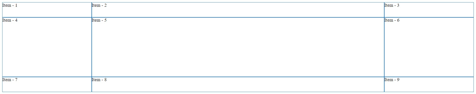
.container{
  display: grid;
  grid-template-columns: 300px auto 300px; /* the width of the columns */
  grid-template-rows: 50px 200px 50px; /* the height of the rows */
}
Grid Gaps
Grid gaps are the spacing between the rows and columns of grid items. There are three properties that control these gaps: grid-row-gap, grid-column-gap, and grid-gap.
The grid-row-gap property controls the amount of space, or how big the gap is, between the rows of grid items. The example below illustrates what this looks like when the grid-row-gap is set to 20px:
    <div class="container">
        <div class="item"></div>
        <div class="item"></div>
        <div class="item"></div>
        <div class="item"></div>
    </div>
.container { display: grid; grid-template-columns: auto auto; grid-template-rows: 40px 40px; grid-row-gap: 20px; } .item{ background-color: #9fceeb; }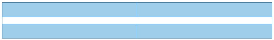
The grid-column-gap property controls the spacing, or the gap, between the columns of grid items. The below example illustrates what this looks like when the grid-column-gap is set to 20px:
.container {
  display: grid;
  grid-template-columns: auto auto;
  grid-template-rows: 40px 40px;
   grid-column-gap: 20px;
}
.item{
  background-color: #9fceeb;
}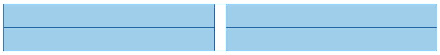
The grid-gap property is a shorthand combination of both the grid-row-gap and grid-column-gap properties. It applies spacing between both the columns and rows. Similar to the above, the below example illustrates what the result looks like when grid-gap is set to 20px:
.container {
  display: grid;
  grid-template-columns: auto auto;
  grid-template-rows: 40px 40px;
  grid-gap: 20px;
}
.item{
  background-color: #9fceeb;
}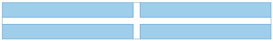
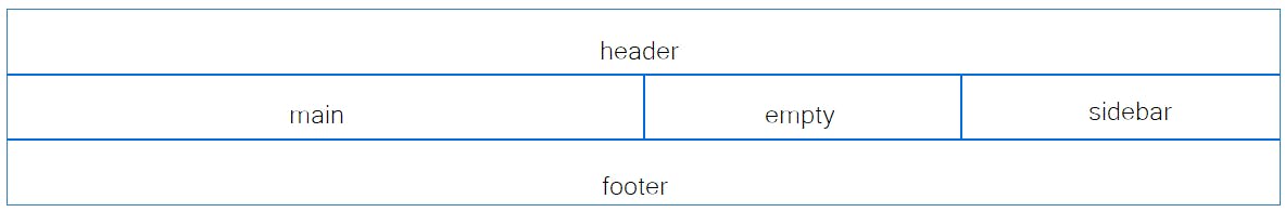
Grid Areas
After declaring grid columns we can define grid-template-areas.
It defines a grid template by referencing the names of the grid areas which are specified with the grid-area property.
.item-a {
  grid-area: header;
}
.item-b {
  grid-area: main;
}
.item-c {
  grid-area: sidebar;
}
.item-d {
  grid-area: footer;
}
.container {
  display: grid;
  grid-template-columns: 1fr 1fr 1fr 1fr;
  grid-template-rows: 50px 50px 50px;
  grid-template-areas:
    "header header header header"
    "main main . sidebar"
    "footer footer footer footer";
}
Aligning & Justifying Content
Controlling where your grid items are displayed within their grid container is done by justifying or aligning them as necessary. Aligning and justifying come in handy when your grid items don’t fill up your entire grid container, leaving room for them to be aligned in different configurations around the container. If you’re familiar with flexbox, then this next section may be second nature to you, if you’re new to this, it’s easy enough to pick up on.
Justifying Content
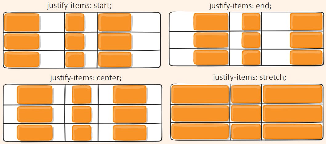
The justify-content property allows us to align our content horizontally, left, and right. It can be set to a variety of values to achieve different layouts.
Values:
start – aligns items to be flush with the start edge of their cell.
end – aligns items to be flush with the end edge of their cell.
center – aligns items in the center of their cell.
stretch – fills the whole width of the cell (this is the default).
Let’s take a look at the image below to see the differences between these property values. This example only shows one version of the HTML and CSS, however, the CSS justify-content property will be adjusted per result.
Aligning Content
When we want to align our grid items vertically, up and down, we use the align-content property, set to the same property values as
Values:
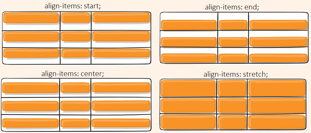
stretch – fills the whole height of the cell (this is the default)
start – aligns items to be flush with the start edge of their cell
end – aligns items to be flush with the end edge of their cell
center – aligns items in the center of their cell
baseline – align items along the text baseline. There are modifiers to baseline — first baseline and last baseline which will use the baseline from the first or last line in the case of multi-line text.
We’ll take a look at the difference between these in the example below, note that I had to set the grid container’s height to be greater than that of the grid items, or else the align-content property wouldn’t have any effect.
place-items
place-items sets both the align-items and justify-items properties in a single declaration.
.center {
  display: grid;
  place-items: center;
Learn more about CSS Grid from CSS Tricks