

In this article, you’ll be learning the basics of CSS Flexbox, which has become a must-have skill for web developers and designers in the last couple of years.
Previously, there were 4 available layout models, mostly managed with the float property.
block- used for sections in a webpage,
inline- used for text,
table- used for two-dimensional table data,
positioned- used in the precise positioning of an element.
In the era of multiple device screen sizes, they were inefficient approaches to developing web layouts.
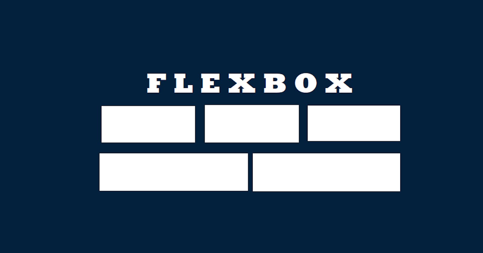
Flexbox
Just like these models in CSS, there is something called the Flexible Box Layout Model, developed as an improved approach to lay out, align and distribute space among items in a container, even when their size is unknown and/or dynamic, without using float or positioning. It helps us efficiently visualize the layout.
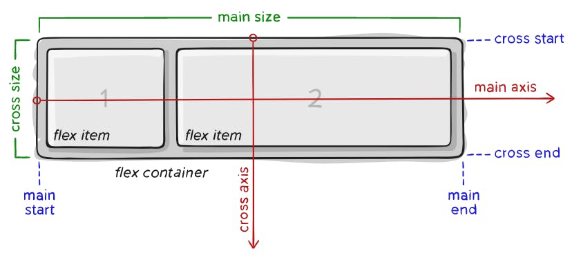
In flexbox, there are mainly two entities - the flex container (parent container) and the flex items (immediate children elements). In this, we have to deal with two axes — the main axis which runs from left to right, and the cross axis which is perpendicular to the main axis and runs from top to bottom.
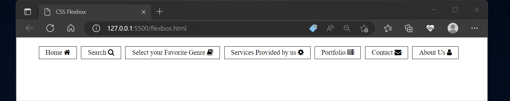
To understand the different aspects and behavior of flexbox, let's look into the typical use case for flexbox "At a Navigation Bar". This will introduce you to the most-used properties of the module.
<nav>
    <ul class="navbar">
        <li><img src="Home.png"> </li>
        <li><img src="Search.png"> </li>
        <li><img src="Services.png"></li>
        <li><img src="contact.png"> </li>
        <li><img src="About.png"> </li>
    </ul>
</nav>
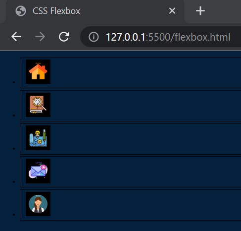
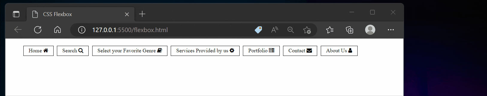
In the above HTML code, you can see there is an unordered list having a class = "navbar" which has five immediate children. Let's apply the display property of flex on it, and let's use the gap property, to give some space between the elements.
.navbar{
  display: flex;
  list-style: none;
  gap: 1.5em;
}
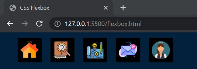
Magically, they are now next to one another.
So, some very important things have happened here. As you know <li> </li> are block-level elements, they stack one on top of each other and stretch to fill up the entire space with their width of auto.
With a display of flex, they are no longer display: block;. They're behaving like flex items.
Also, flex items are taking as small space as they possibly can, to maintain everything in one line. Let's discuss that.
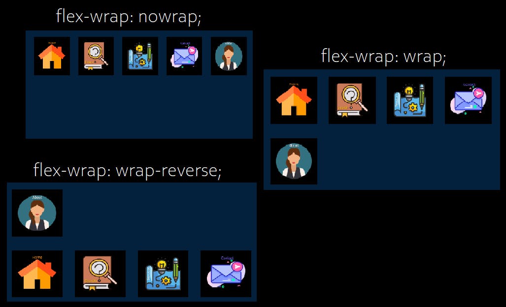
Flexbox-wrap
By default, all flex items will try to fit onto one line.
If we use the display of flex, it'll shrink flex items down to as small as they can possibly get without any line breaks. If you minimize the screen and it runs out of room, flex items will keep on squishing and getting smaller until you get some overflow.
You can change that and allow the items to wrap by using the flex-wrap property.
nowrap- (default value) All flex items will be on one line.wrap- flex items will wrap onto multiple lines, from top to bottom.wrap-reverse- flex items will wrap onto multiple lines from bottom to top.
Here, let's apply flex-wrap: wrap; to the parent container navbar class, you will see that the child elements will start to wrap.
.navbar{
  display: flex;
  list-style: none;
  flex-wrap: wrap;
}
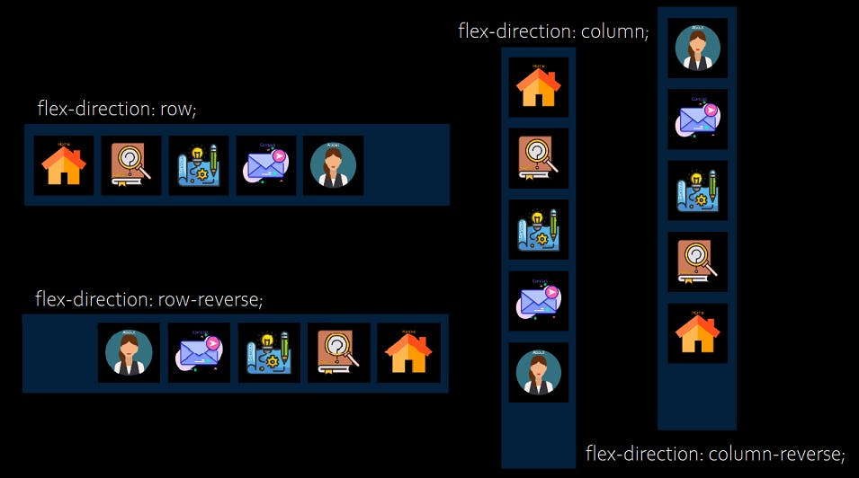
Flex-direction
The flex-direction CSS property establishes the main axis and defines the direction (normal or reversed) of flex items placed in the flex container.
row- (default value) Flex items are displayed horizontally, as a rowrow-reverse- Same as row, but in reverse ordercolumn- The flex items are displayed vertically, as a columncolumn-reverse- Same as the column, but in reverse order
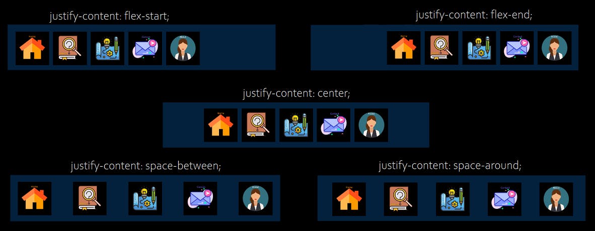
Justify Content
The justify-content CSS property defines the alignment along the main axis. It actually helps to distribute space between and around content items along the main axis of a flex container.
flex-start- (default value) Items are packed towards the start of the flex-direction.center- Items are positioned in the center of the container.flex-end- Items are packed towards the end of the flex-direction.space between- Items will have space between them.space-around- Items have space before, between, and after them.
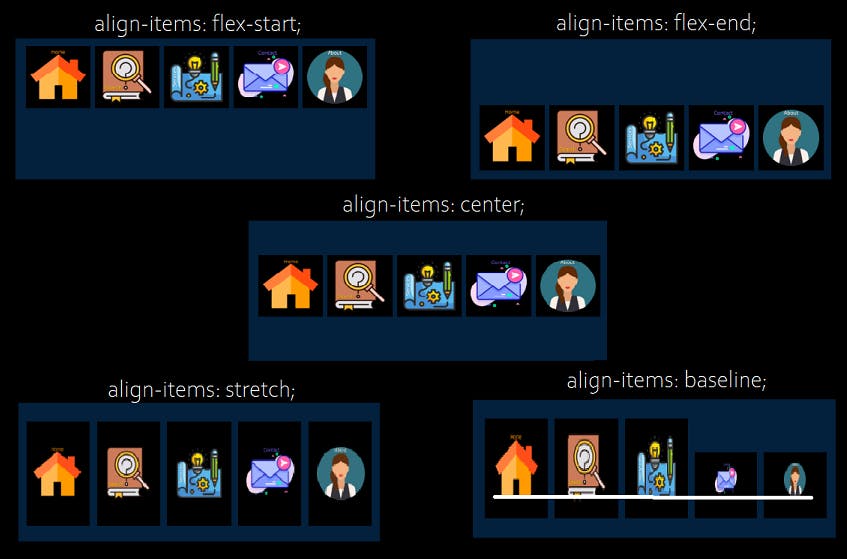
Align Items
The align-items CSS property defines the default behavior for how the flex items are laid out along the cross-axis on the current line. It basically controls the alignment of items on the cross-axis.
stretch- (default value) Stretch to fill the containerflex-start- Items are placed at the start of the cross-axis.flex-end- Items are placed at the end of the cross-axis.center- Items are centered on the cross-axis.baseline- Items are aligned such that their baseline aligns.
Align Content
The align-content CSS property is similar to align-items, but instead of aligning flex items, it aligns flex lines. This property sets the distribution of space between and around content items along a flexbox’s cross-axis.
stretch- (default value) Lines stretch to take up the remaining space.flex-start- Lines are packed toward the start of the flex container.center- Lines are packed toward the center of the flex container.flex-end- Lines are packed towards the end of the flex container.space between- Lines are evenly distributed in the flex container.space-around- Lines are evenly distributed in the flex container, with half-spaces on either end.
Flex-grow
The flex-grow CSS property specifies how much the item will grow relative to the rest of the items inside the same container. It accepts as a unitless value that serves as a proportion. Negative numbers are invalid.
number specifies how much the item will grow relative to the rest of the elements. The default value is 0.
Flex-shrink
The flex-shrink specifies how the item will shrink relative to the rest of the flexible items inside the same container. This property defines the ability of a flex item to shrink if necessary.
number specifies how much the item will shrink relative to the rest of the elements. The default value is 1.
Wish you happy learning!
Click Here to Play an interesting Flexbox Froggy Game
Other resources which are really helpful to dive deeper into other CSS concepts — MDN Docs and CSS Tricks website.